Drop an image hereor click to chooseJPG, PNG, WebP
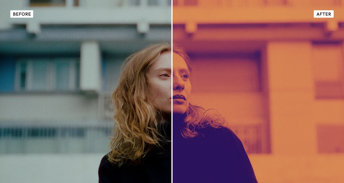
About the Duotone Effect
Last updated 21 August 2026
How the effect works
Duotone began as a printing economy. Reproducing a photograph in full colour needs four ink plates; reproducing it in one gives you a flat grey image with a short tonal range. Printers found that two inks — usually black plus a single spot colour — recovered most of the depth at half the cost, and the technique became standard for book plates and annual reports.
What made it survive the arrival of cheap colour printing is that it does something colour cannot: it forces a single mood onto whatever you feed it. Any two photographs run through the same duotone come out belonging to the same set, which is why Spotify built an entire visual identity on it and why brand systems keep reaching for it.
Technically this is a gradient map. Every pixel is reduced to its brightness, and that brightness picks a colour from a two-point gradient. Midpoint decides where the two colours meet — moving it toward the shadows gives more of the highlight colour, and vice versa — while intensity controls how much of the original colour is allowed back in.
What each control does
| Control | Range | Default | What it changes |
|---|---|---|---|
| Palette | presets or custom | — | Pick a ready-made pair or set both colours yourself. |
| Midpoint | 20–80 | 50 | Where the two colours meet. Lower gives more of the highlight colour, higher more of the shadow colour. |
| Intensity | 0–100 | 100 | How completely the image is mapped. Below 100 lets some original colour back through. |
| Contrast | −100 to +150 | 20 | Tonal separation before the mapping. Higher pushes more pixels to the two extremes. |
| Brightness | −100 to +100 | 0 | Overall exposure, applied before the mapping. |
| Grain | 0–100 | 10 | A little noise stops large flat areas of a single colour looking digitally sterile. |
Tips
- Pick colours far apart in brightness, not just in hue. Two colours of similar lightness produce a flat, muddy result no matter how different the hues are.
- Raise contrast before mapping. Duotone has only two colours to work with, so a flat source has nowhere to go.
- Drop intensity to around 80 if faces look unnatural — letting a little original colour through keeps skin readable.
- For a brand set, fix the two colours and the midpoint, then run every image through unchanged. Consistency is the whole reason to use duotone.
Common uses
Brand and campaign imagery, album and playlist covers, event posters, presentation backgrounds, editorial portraits, social templates, and any set of photographs that needs to look like it belongs together.
Frequently asked questions
What is a duotone effect?
A duotone effect maps a photograph onto two colours, using a gradient that runs from one colour in the shadows to another in the highlights. It began as a printing technique that recovered tonal depth using two inks instead of four, and survives because it forces a consistent mood onto any image.
How do I make a photo two colours?
Map its brightness onto a two-point gradient, so shadows take one colour and highlights the other. Choose colours that differ in brightness rather than only in hue — two colours of similar lightness produce a flat, muddy result however different they look side by side.
How do I make my photos match my brand colours?
Set the two colours and the midpoint once, then run every image through unchanged. Any two photographs put through the same duotone come out belonging to the same set, whatever they showed originally — which is why brand systems and streaming services reach for it.
Is the duotone effect free to use?
Yes. The duotone effect is free, and you can adjust every setting and preview the result without signing up. Credits are only needed to download at full original resolution; the preview and standard-resolution download cost nothing.
Do I need to upload my photo?
No. The duotone effect runs entirely in your browser, so your original photo is processed on your own device and never leaves it. If you are signed in and save a full-resolution download, the rendered result — not your original — is stored in your private account folder, encrypted with AES-256, and deleted automatically after 30 days.
How do I choose colours for a duotone?
Pick two colours that differ in brightness, not just in hue. A dark colour for the shadows and a much lighter one for the highlights gives depth; two colours of similar lightness produce a flat, muddy result however different their hues are. Starting from a preset and adjusting is usually faster than choosing both from scratch.
What is the difference between duotone and duo halftone?
Duotone maps the image smoothly onto two colours, so tone is continuous. Duo Halftone rebuilds the image from printed dots in two inks instead, complete with screen angles and misregistration. Use duotone for a clean graphic treatment and duo halftone when it should look physically printed.
Can I use the duotone effect on client or commercial work?
Yes. Images you create with the duotone effect can be used for personal and commercial projects, including client work, packaging and merchandise. Full terms are on the licence page.
Related effects
For two-ink printing with visible dots, see Duo Halftone. Dramatic Black and White gives full monochrome control, Risograin maps onto a single risograph ink, and Gradientor abstracts a photo into a colour wash.