
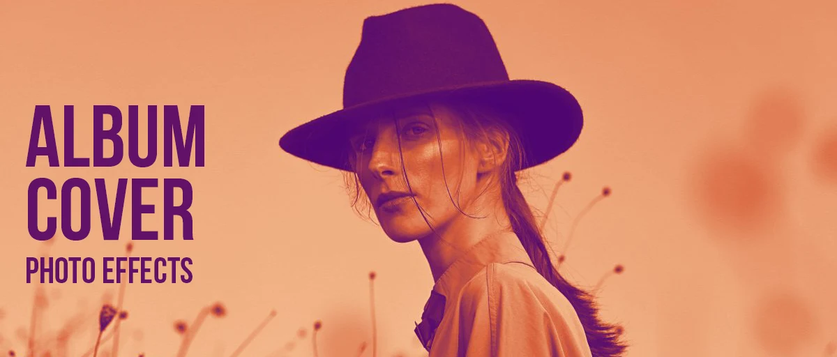
Album Cover Photo Effects
At 200 pixels, cover art has one main job: to be recognisable. All eight photo effects on this page work by either simplifying, abstracting or adding a colour treatment, which is what makes a cover memorable once it is sized down and seen small.
Last updated 23 August 2026
A cover has to work at two sizes that have almost nothing in common. On a record sleeve it is 12 inches across and someone is holding it. In a playlist it is a thumbnail in a scrolling list, next to forty others, and it gets about half a second. Artwork that only works at the first size has failed at the one that actually decides whether anyone clicks.
What survives when sized down is not a matter of taste, it is how vision works. Shrinking an image throws away high-frequency detail — fine texture, thin lines, small type — and keeps low-frequency information, which means large areas of contrasting tone and colour.
A cover built on a strong silhouette and two colours stays readable at any size. One built on delicate detail turns to grey mush somewhere on the way down.
That is why every effect below pushes an image toward fewer, bolder elements — stripping tone, flattening to two colours, breaking the subject into tiles, or replacing it with a wash. What is left is what the thumbnail keeps. Piling texture onto an already busy photograph moves the other way, however good it looks at full size.
One practical thing before you start. Spotify, Apple Music and Bandcamp all want square artwork, and Spotify wants at least 3000 by 3000 pixels to distribute it. Work square from the beginning — cropping a landscape photo down at the end almost always ruins the composition you chose it for.
Which one should you use?
Genre is the fastest way in — the table pairs each effect with the kind of record it tends to suit, and says what it actually does to the image. The cards below show all eight on a real photograph.
| Effect | Best for | What it does |
|---|---|---|
| Grainy Film Poster | Rock, indie, post-punk | Heavy grain and crushed tone — survives enlargement and shrinking |
| Duotone | Electronic, brand-led releases | Two colours only, so it is unmistakable at any size |
| Risograin | DIY, punk, small labels | One flat ink with grain, as a risograph would print it |
| Dramatic Black & White | Classic, timeless, jazz | High-contrast monochrome with channel control |
| Prismatic Light | Ambient, electronic, dream pop | Lens flare and colour fringing over a photograph |
| Pixelator | Electronic, experimental | Rebuilds the image from rounded tiles |
| Gradientor | Type-led covers, from a photo | Blurs a photograph down to a smooth colour wash |
| Mesh Gradients | Type-led covers, from nothing | Generates a background with no photo needed |
Every effect in this group
-
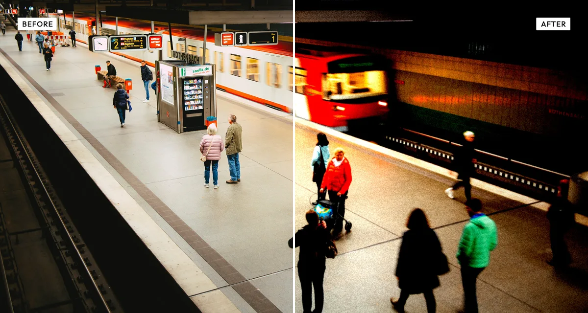 Grainy Film Poster
Heavy grain, blacks crushed, highlights blown. Reads as urgent and hand-made — and because the grain is coarse it holds up both blown up to vinyl size and shrunk to a thumbnail.
Try the effect
Grainy Film Poster
Heavy grain, blacks crushed, highlights blown. Reads as urgent and hand-made — and because the grain is coarse it holds up both blown up to vinyl size and shrunk to a thumbnail.
Try the effect
-
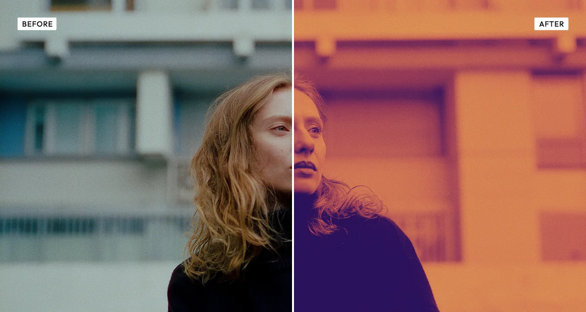 Duotone
Two colours, nothing else, which is what makes it readable at any size. Lock the palette once and every single from the same release belongs to the same set without you doing anything.
Try the effect
Duotone
Two colours, nothing else, which is what makes it readable at any size. Lock the palette once and every single from the same release belongs to the same set without you doing anything.
Try the effect
-
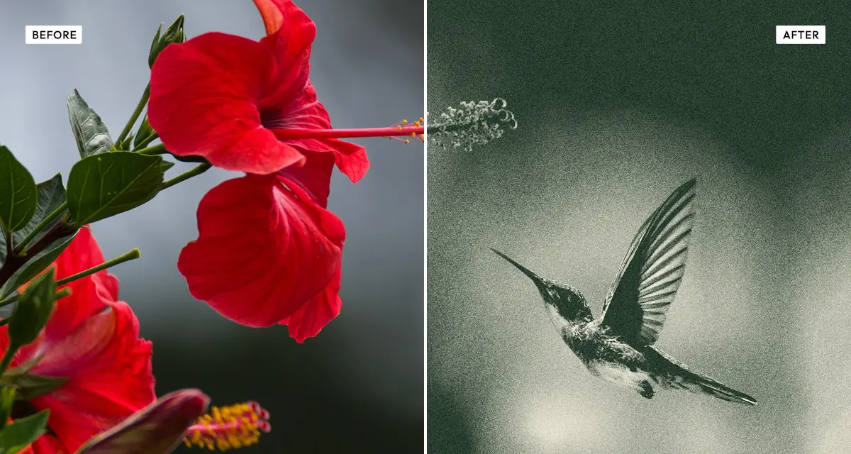 Risograin
One flat ink with heavy grain, the way a risograph prints. The default look for small labels and DIY releases — and genuinely cheap to reproduce if you ever press a physical run.
Try the effect
Risograin
One flat ink with heavy grain, the way a risograph prints. The default look for small labels and DIY releases — and genuinely cheap to reproduce if you ever press a physical run.
Try the effect
-
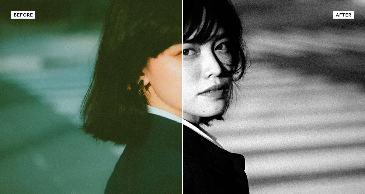 Dramatic Black & White
Monochrome with a channel mixer, so you decide how colours become grey. The most durable option on the list: it dates slower than any colour treatment and always reproduces cleanly.
Try the effect
Dramatic Black & White
Monochrome with a channel mixer, so you decide how colours become grey. The most durable option on the list: it dates slower than any colour treatment and always reproduces cleanly.
Try the effect
-
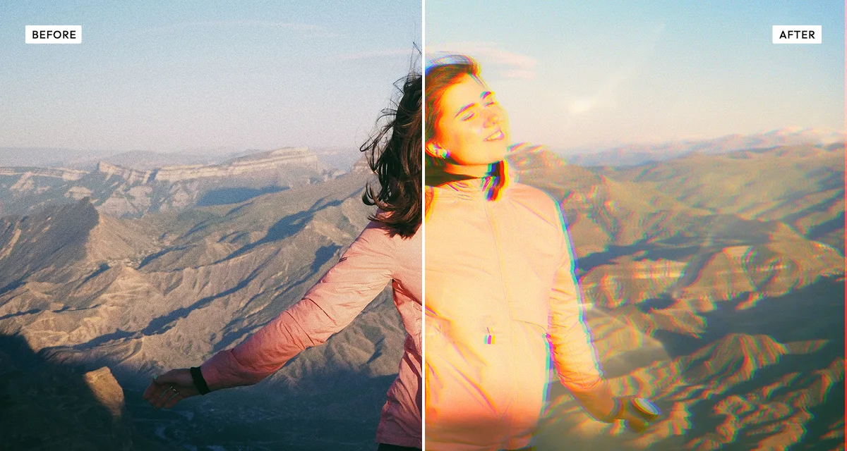 Prismatic Light
Lens flare and colour fringing over a photo. Suits ambient and electronic records, where the cover should feel like something rather than show something.
Try the effect
Prismatic Light
Lens flare and colour fringing over a photo. Suits ambient and electronic records, where the cover should feel like something rather than show something.
Try the effect
-
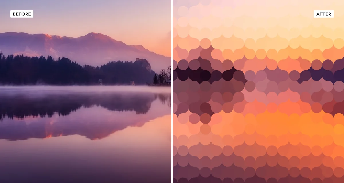 Pixelator
Rebuilds the image out of rounded tiles, so the subject is hinted at rather than shown. Looks deliberate at thumbnail size, where the tiles just become the texture.
Try the effect
Pixelator
Rebuilds the image out of rounded tiles, so the subject is hinted at rather than shown. Looks deliberate at thumbnail size, where the tiles just become the texture.
Try the effect
-
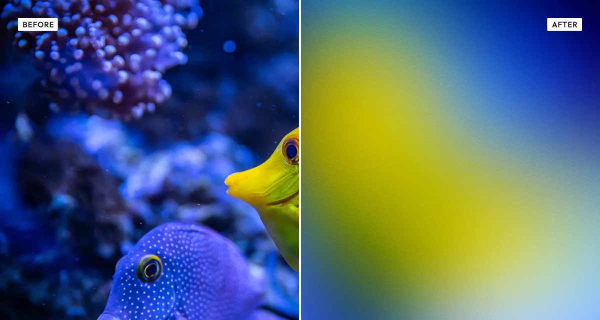 Gradientor
Blurs a photograph down to a smooth colour wash — the composition and the palette survive, the detail does not. Useful when you want a background that still comes from the band's own photos.
Try the effect
Gradientor
Blurs a photograph down to a smooth colour wash — the composition and the palette survive, the detail does not. Useful when you want a background that still comes from the band's own photos.
Try the effect
-
 Mesh Gradients
Makes an abstract colour background with no photo involved at all. Export it square, put your type over the top — the usual route for a cover that is mostly typography.
Try the effect
Mesh Gradients
Makes an abstract colour background with no photo involved at all. Export it square, put your type over the top — the usual route for a cover that is mostly typography.
Try the effect
How to choose, and what to avoid
Check it at 200 pixels before you commit to anything.
Shrink your draft and look at it sitting next to other covers in a playlist. Most artwork that fails, fails right here — and it is a two-minute check that almost nobody bothers to do.
Take away, do not add.
Every effect here removes information: colour, tone, detail. That is the entire point. Piling texture on top of an already busy photograph makes a cover harder to read small, not more interesting.
Work square from the start.
Spotify wants 3000 by 3000 pixels minimum, and squaring off a landscape photo at the last minute usually cuts the composition to pieces. If you need to crop or resize first, the image resizer handles it in the browser.
Do not put fine type over grain.
Grainy Film Poster and Risograin will both eat thin lettering alive — the grain and the type are fighting at the same scale. If the cover is type-led, go with Duotone, Gradientor or Mesh Gradients and keep the background quiet.
Frequently asked questions
What size should album cover art be?
Square, and at least 3000 by 3000 pixels — that is Spotify's minimum for distribution, and Apple Music and Bandcamp take the same. Work at that size from the start rather than upscaling later, because enlarging invents detail that was never there and it shows badly at print size.
How do I make album cover art for free?
Start with a photo or generate a background, run one effect over it that simplifies it, then add your type in whatever layout tool you like. Every effect here is free at any setting with no account, and they run in your browser so nothing gets uploaded.
What makes a good album cover?
Being readable at thumbnail size. A cover shows up at roughly 200 pixels in a playlist far more often than it shows up large, so contrast, flat colour and strong shape matter more than detail does. Shrink your draft and put it beside other covers before you commit — the failures jump out immediately.
Which effect works best for a music cover with text on it?
Duotone, Gradientor or Mesh Gradients. All three leave you calm, flat areas that type sits on cleanly. Keep grain-heavy effects away from lettering — grain and thin type fight at the same scale, and the text stops being readable the moment the cover is shrunk.
Can I use these effects on artwork I sell or release commercially?
Yes. Anything you make here can be used commercially, including releases, merch and packaging. You do need the rights to the source photograph itself, as always. Full terms are on the licence page.
Do I need a photo to make a cover?
No. Mesh Gradients builds an abstract background from nothing — pick a palette, set the ratio to 1:1, reroll until you like the arrangement, export. It is the usual starting point for a cover that is mostly typography anyway.