
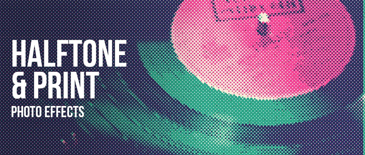
Halftone & Print Photo Effects
Look closely at any printed photo and you will find it is made of tiny dots. At any point on the page a press can only do one of two things — put ink there, or leave it alone. There is no half-ink, so grey has to be faked. These seven filters each fake it a different way.
Last updated 23 August 2026
The faking works because of distance. Hold a newspaper photograph close and it falls apart into a grid of black dots, some fat and some tiny. Step back and your eye stops picking them out one by one, blends them together, and sees grey instead. Every printing process is a version of that, and they differ in three ways.
What differs between processes is the mark. A halftone screen uses dots that grow and shrink with tone. An engraver cut lines that thicken as the tone darkens. A risograph lays down one flat ink per pass, so tone has to be carried by grain and by how much of the paper is covered.
Then there is how coarse the mark is, and that came down to the paper. Newsprint ran a screen of roughly 65 to 85 lines per inch because ink spreads on cheap absorbent stock and anything finer would have filled in and gone solid. Magazines on coated paper managed 150 and up. That single number is why you can see the dots in an old newspaper from arm's length and not in a magazine.
And then there is what goes wrong, which is most of what makes print look like print. Ink layers land fractionally out of register, so colours fringe at the edges. Ink bleeds into the fibre and softens every dot. Toner in a photocopier either sticks or does not, so midtones barely survive at all and the roller leaves streaks.
A zine is mostly the first two — one flat ink, coarse grain. A newspaper page is mostly the third. A punk flyer run through a photocopier is almost entirely the fourth. Knowing which you are after is the whole decision, and everything below follows from it.
Which one should you use?
The table sorts all seven by process and by the kind of mark each one leaves. Every filter also has its own card below it, with a before and after, so you can see how it handles a real photograph before you commit to one.
| Effect | Best for | What it does |
|---|---|---|
| Risograin | Zines, gig posters | One flat ink with heavy grain and posterised tone |
| Risograin Flattener | Screen print, t-shirts | Tone collapsed almost entirely — shape only, no gradation |
| Duo Halftone | Two-colour print, album art | Dots in two inks, with screen angles and deliberate misregistration |
| Engrave Halftone | Certificates, heritage brands | Ruled lines instead of dots — steel engraving |
| Old Newspaper | Period and archival design | Coarse dot screen, ink bleed, aged paper |
| Photocopy Scan | Punk flyers, DIY | Threshold black and white, toner streaks, scanner drag |
| Coolage | Collage, photomontage | Fragments the image and prints some pieces as halftone |
Every effect in this group
-
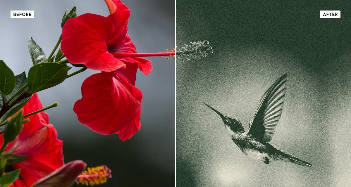 Risograin
Puts your photo onto a single risograph ink with grain and posterised tone, but keeps enough detail that it still looks like a photo. The default pick for a zine or gig poster.
Try the effect
Risograin
Puts your photo onto a single risograph ink with grain and posterised tone, but keeps enough detail that it still looks like a photo. The default pick for a zine or gig poster.
Try the effect
-
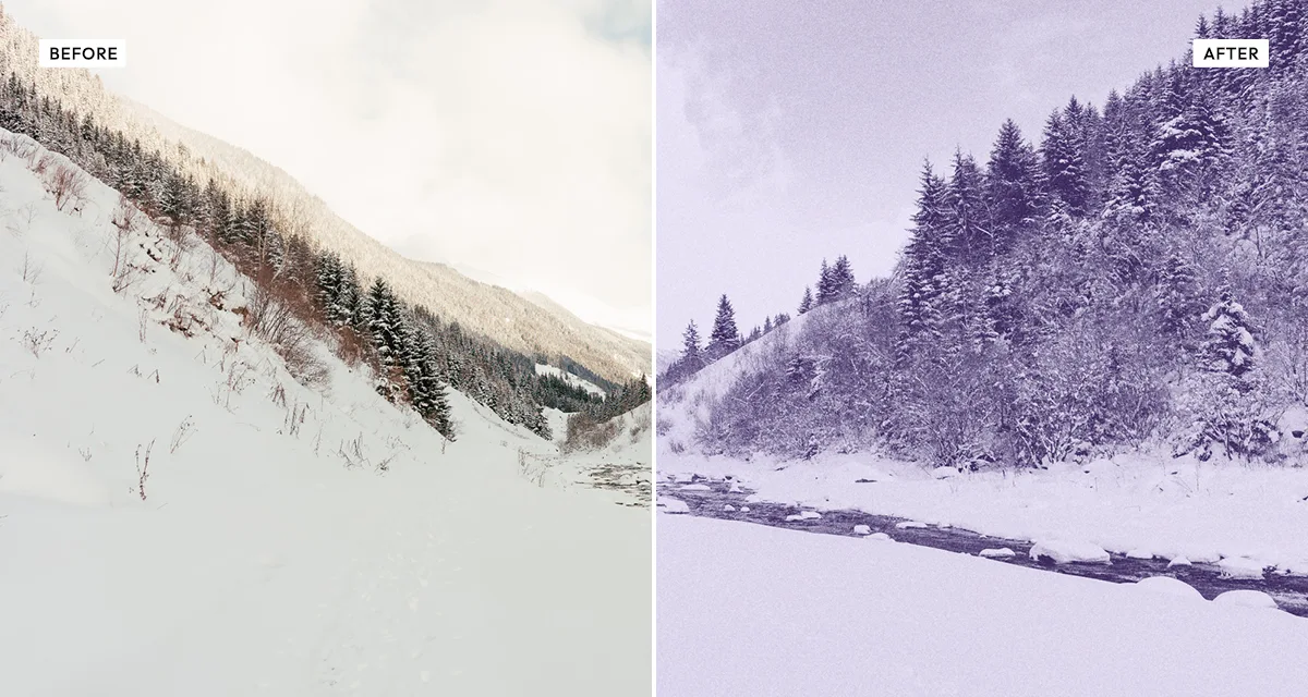 Risograin Flattener
Same single ink, pushed much harder — tone almost entirely gone, shape left behind. Use it when the file has to survive screen printing, which loves flat areas and hates gradients.
Try the effect
Risograin Flattener
Same single ink, pushed much harder — tone almost entirely gone, shape left behind. Use it when the file has to survive screen printing, which loves flat areas and hates gradients.
Try the effect
-
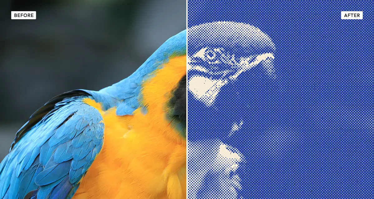 Duo Halftone
Rebuilds the picture out of dots in two inks, screen angles and all, slightly out of register on purpose. That tiny offset between layers is what makes it look genuinely printed.
Try the effect
Duo Halftone
Rebuilds the picture out of dots in two inks, screen angles and all, slightly out of register on purpose. That tiny offset between layers is what makes it look genuinely printed.
Try the effect
-
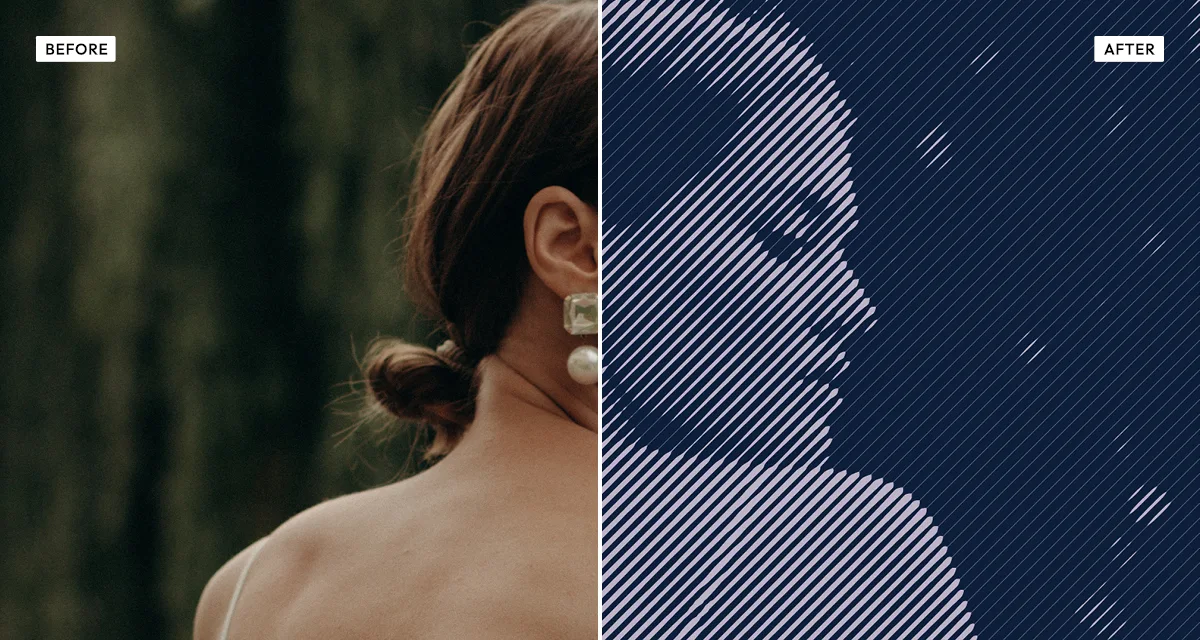 Engrave Halftone
Lines instead of dots, getting heavier as the tone gets darker, the way an engraver cut them. Feels formal and official — it is the visual language of banknotes and certificates.
Try the effect
Engrave Halftone
Lines instead of dots, getting heavier as the tone gets darker, the way an engraver cut them. Feels formal and official — it is the visual language of banknotes and certificates.
Try the effect
-
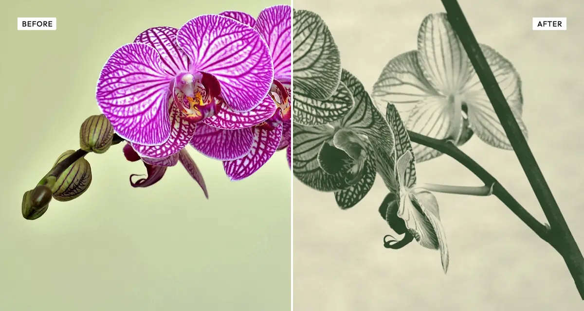 Old Newspaper
A really coarse dot screen, softened by ink bleed, sitting on yellowed paper. Newsprint ran 65 to 85 lines per inch against 150 for magazines, which is why you can see the dots from arm's length.
Try the effect
Old Newspaper
A really coarse dot screen, softened by ink bleed, sitting on yellowed paper. Newsprint ran 65 to 85 lines per inch against 150 for magazines, which is why you can see the dots from arm's length.
Try the effect
-
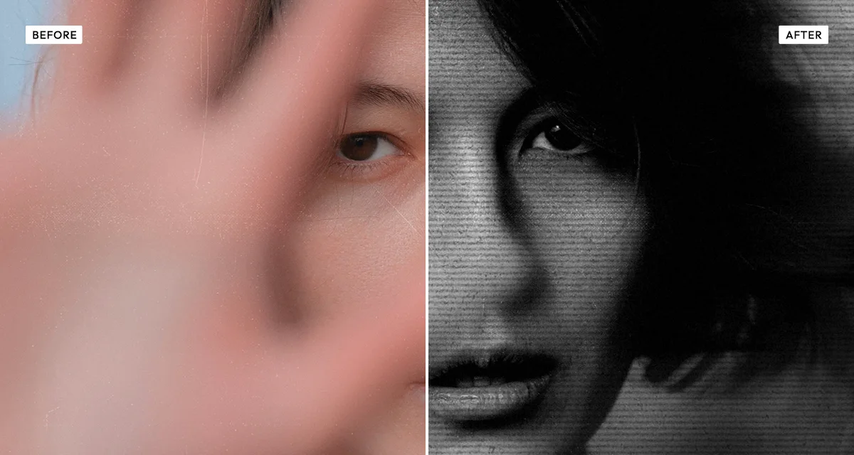 Photocopy Scan
Not printing at all really, but xerography — toner either sticks or it does not, so midtones barely make it through. The faults are the whole point: streaks, drag, scanlines.
Try the effect
Photocopy Scan
Not printing at all really, but xerography — toner either sticks or it does not, so midtones barely make it through. The faults are the whole point: streaks, drag, scanlines.
Try the effect
-
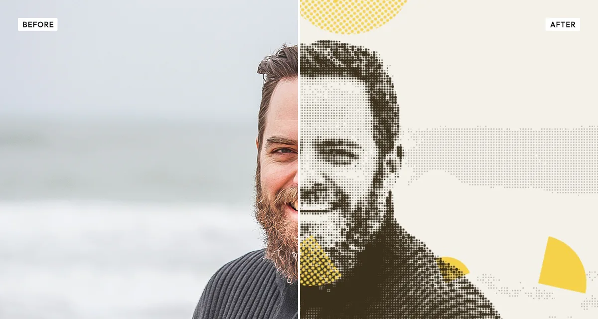 Coolage
Chops one photo into overlapping fragments and prints some of them as halftone. It is cut-and-paste photomontage, where every piece looks like it was torn out of something printed.
Try the effect
Coolage
Chops one photo into overlapping fragments and prints some of them as halftone. It is cut-and-paste photomontage, where every piece looks like it was torn out of something printed.
Try the effect
How to choose, and what to avoid
Start with how many inks you want.
One ink means Risograin or its Flattener. Two means Duo Halftone. Black only means Old Newspaper, Photocopy Scan or Engrave Halftone. That single decision cuts the list down faster than anything else you could ask.
Then decide whether it should still look like a photograph.
Risograin, Duo Halftone and Old Newspaper hold on to tonal detail. The Flattener, Photocopy Scan and Engrave Halftone throw most of it away and leave you with shape — which is exactly right for a t-shirt or a flyer, and exactly wrong for a portrait you care about.
Push the contrast up before you start.
Every printing process eats midtones, so a flat source photo turns to mud. This is far and away the most common reason a print effect looks bad, and it is one slider, thirty seconds, before you do anything else.
Keep busy photos out of it.
Detailed scenes with lots of overlapping texture fall apart under a dot or line screen, because the screen can only describe one texture at a time. Bold subjects with clear separation between figure and background survive all seven of these. Complicated ones survive none of them.
Frequently asked questions
How do I make a photo look printed?
Break the image down into marks a press could actually make — dots, lines or grain — then put the faults of the process back in. Ink layers slightly out of register, ink bleeding into the paper and a coarse screen are what look like print. A perfect dot pattern with no faults still looks digital.
What is a halftone effect?
A halftone fakes smooth tone using dots of different sizes: big dots look dark, small ones look light, and from a normal distance your eye blends them into shades. Presses need this because ink cannot be laid down in continuously varying amounts.
Which effect should I use for a zine or gig poster?
Risograin if it should still look like a photograph, or the Risograin Flattener if it should look like a graphic. Both copy risograph printing, which is how most zines and gig posters are actually made — one flat soy ink per pass, grain and all.
How do I make artwork for screen printing or a t-shirt?
Flatten it to a single ink so there are no midtones for the screen to lose, keep the silhouette strong, and export as lossless PNG so the edges stay crisp when the printer separates your file. The Risograin Flattener exists for exactly this.
Why does my halftone look like a shimmering pattern?
That is moiré — the dot grid interfering with fine detail already in your photo. Turn the smoothing up to soften the source before it gets screened, or nudge the screen angle. Shrinking the dots usually makes it worse, not better.
Are these halftone and print effects free?
Yes, all seven, at any setting, no account. Your photo is processed in your browser rather than sent to a server. Credits only apply to full original-resolution downloads — previewing and standard-resolution download are free.